Supercuts
Brand Refresh
2021
Crafting a new identity for a brand that needs a brand refresh
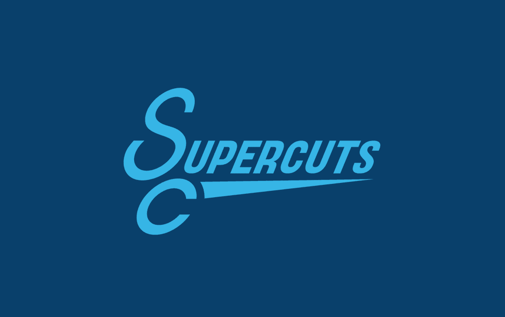
"Shear" Imagery
SuperCuts is associated for bad haircuts, emphasis on quantity over quality and they are in desperate need of not only a branding redesign, but of a rebranding of their corporate identity.
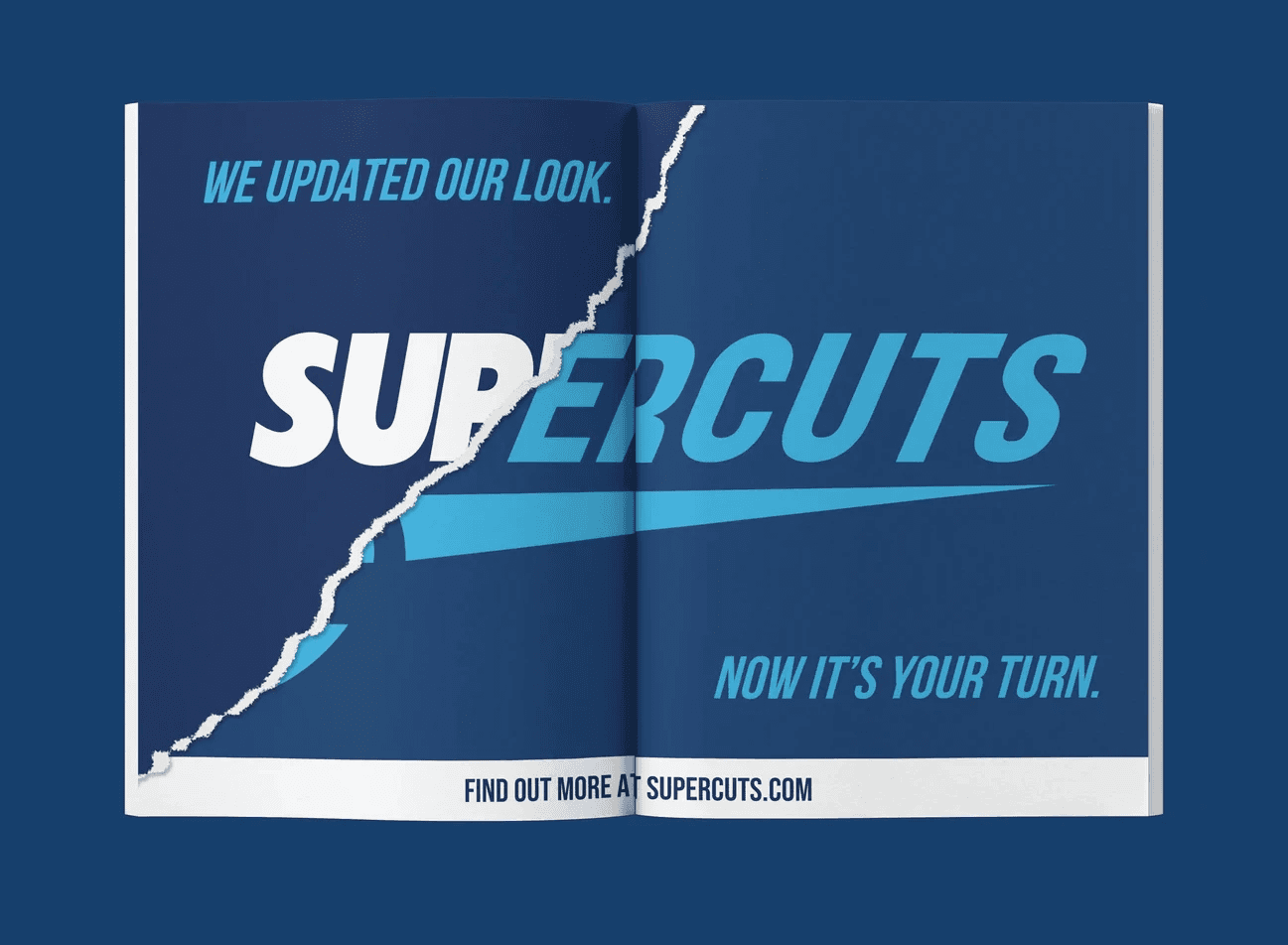
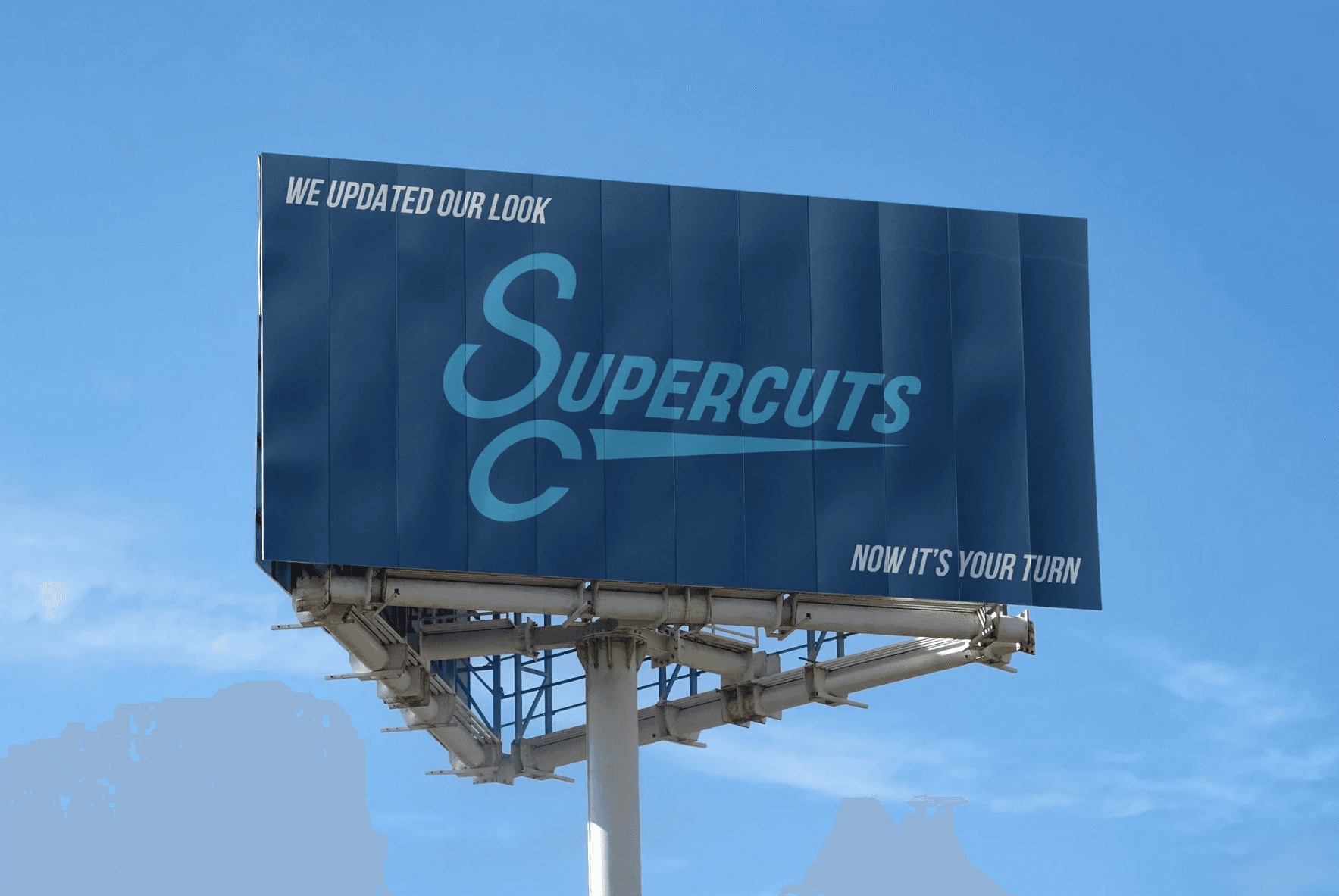
The typeface of the logo is updated to a more modern typeface (Bebas Neue,) and is italicized to bring a sense of mobility. The letters S and C are arranged to create an image that resembles the handles on shears and a sleek, sharp shape completes the shear imagery.
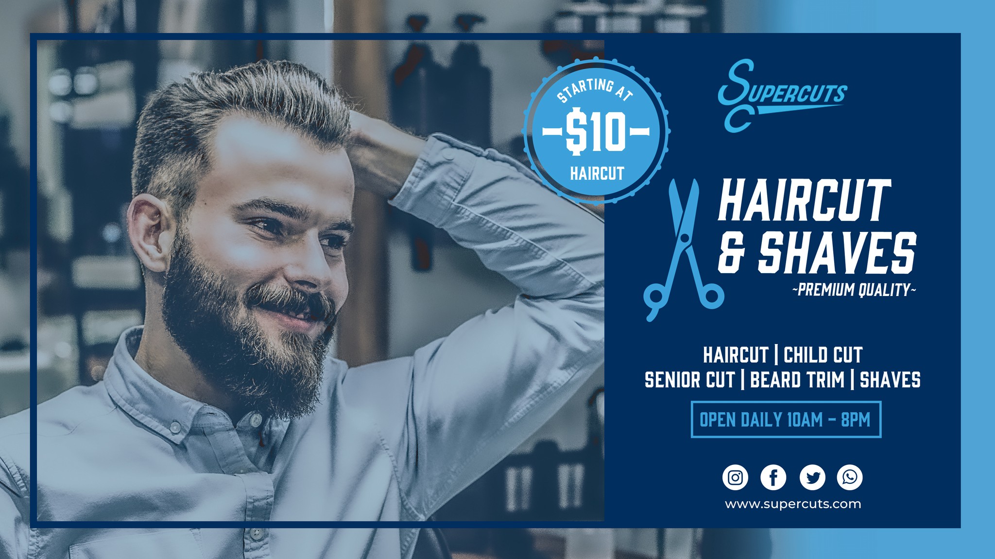
Branding Advertisements
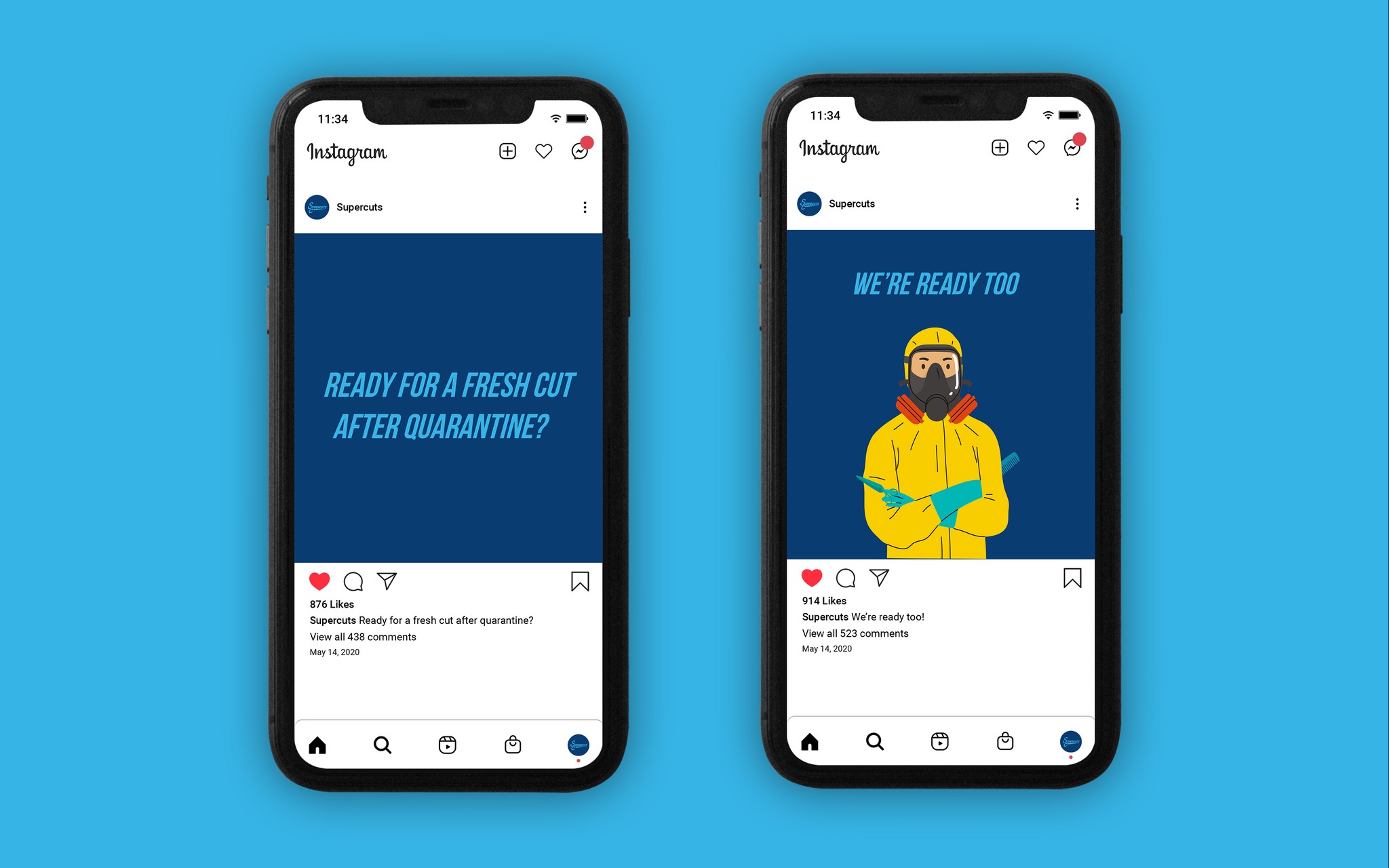
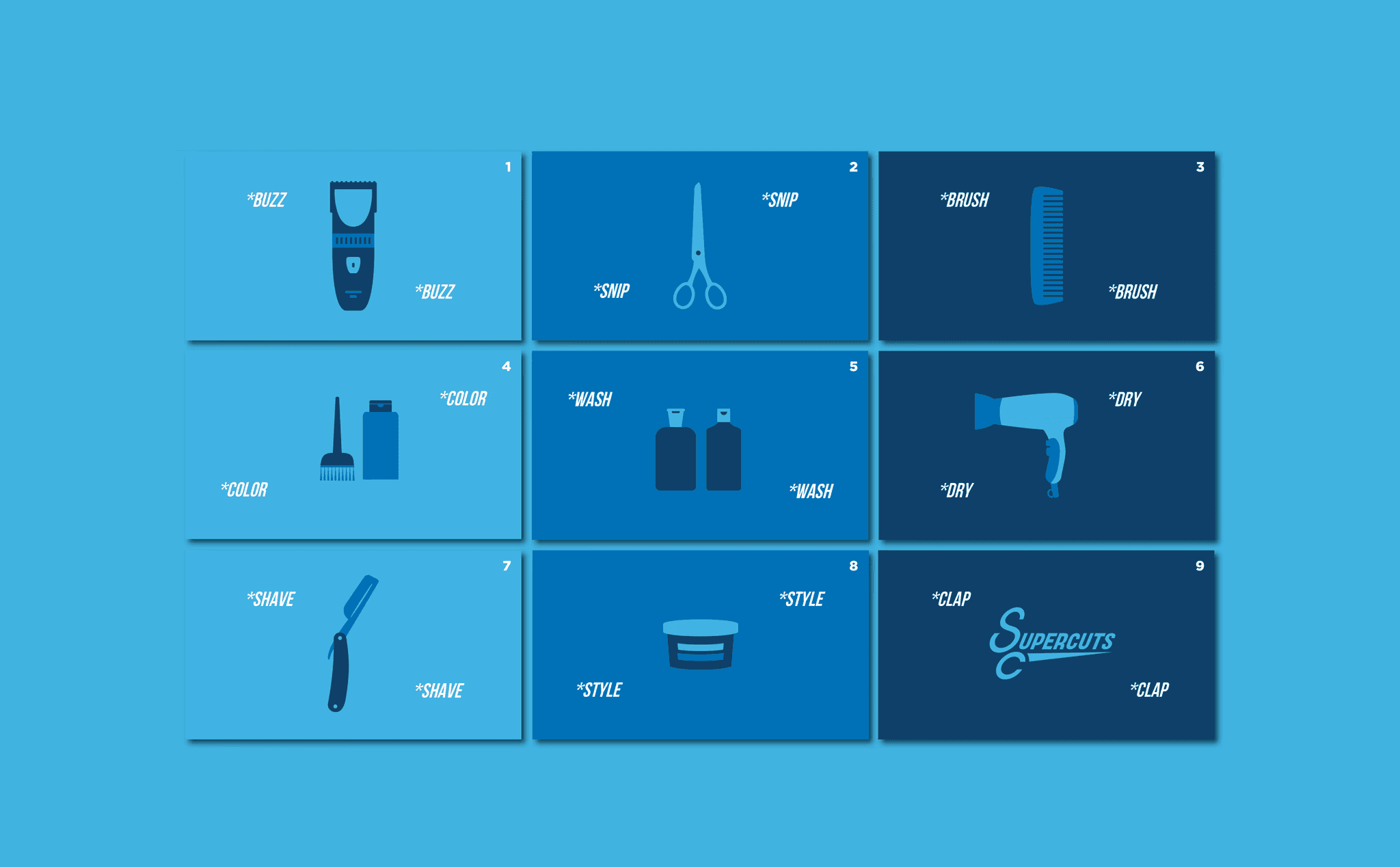
With the brand new logo, I focused on how to market and advertise the brand's refresh. Mockups of print ads, billboards, social media, and televised commercials were the mediums are shown here to showcase how advertisements would be used and displayed.
