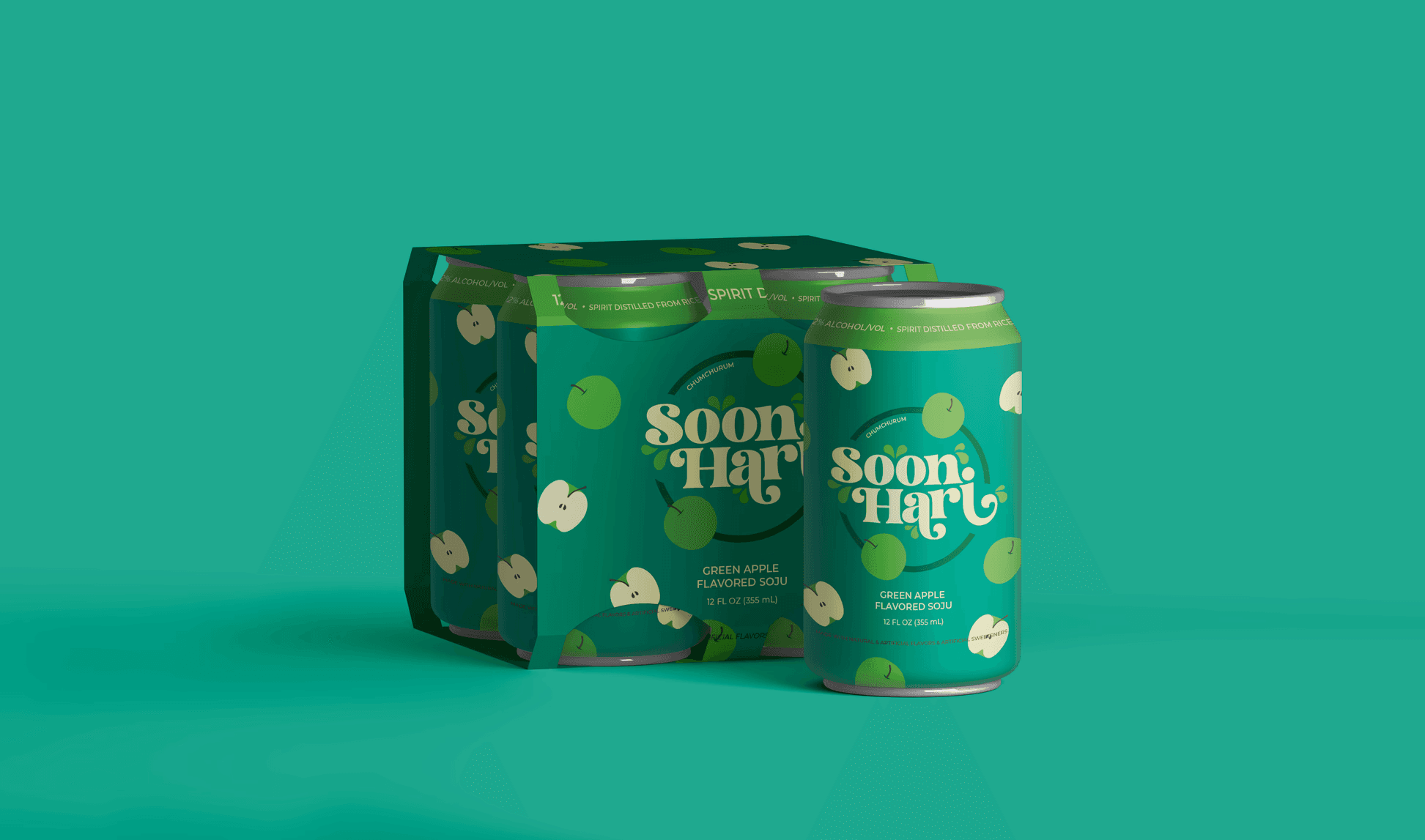
Soonhari Soju
Brand Refresh
2024
A refreshing take on a hard beverage brand for a Western demographic
East Meets West - Again
Can It?
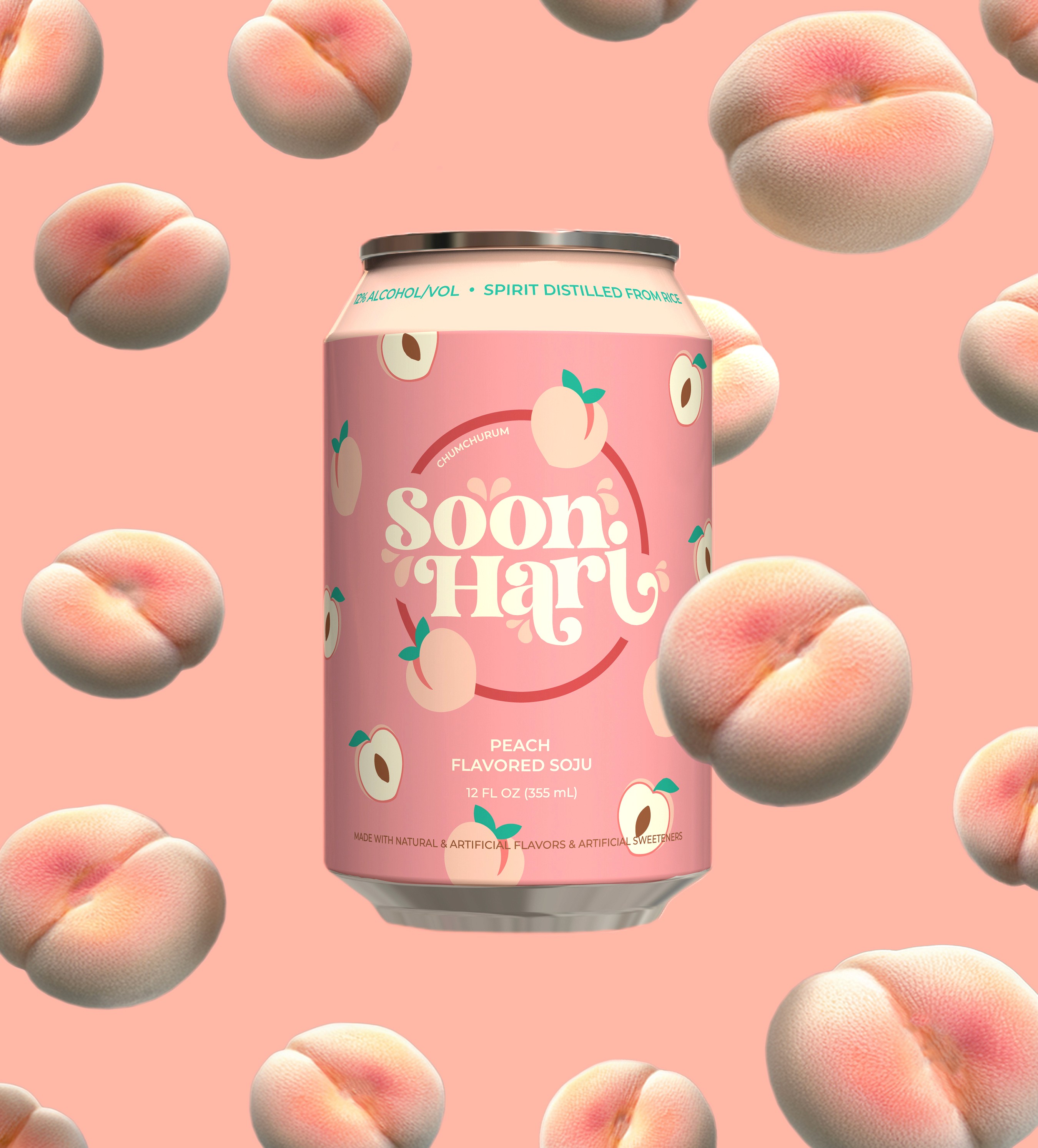
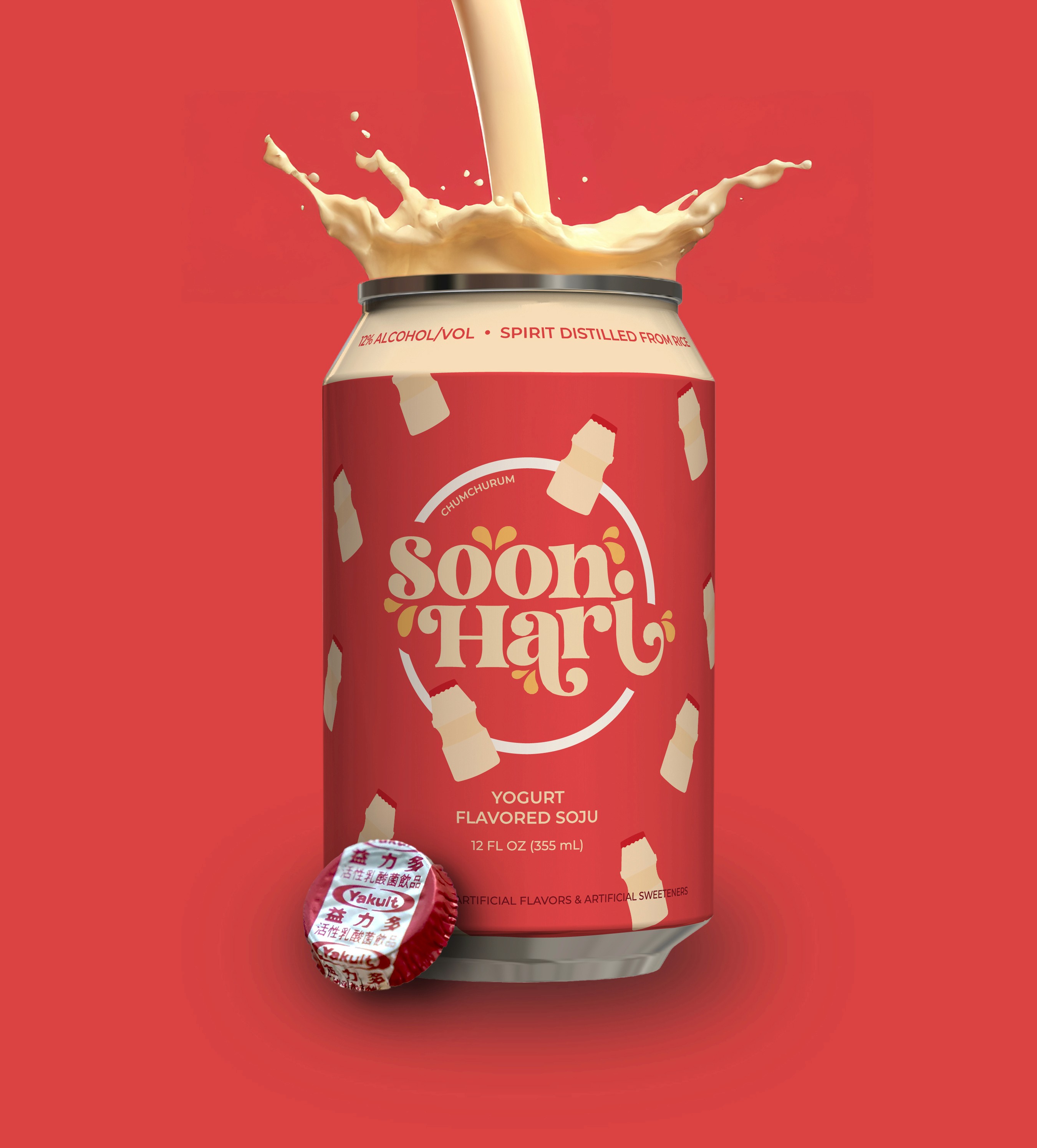
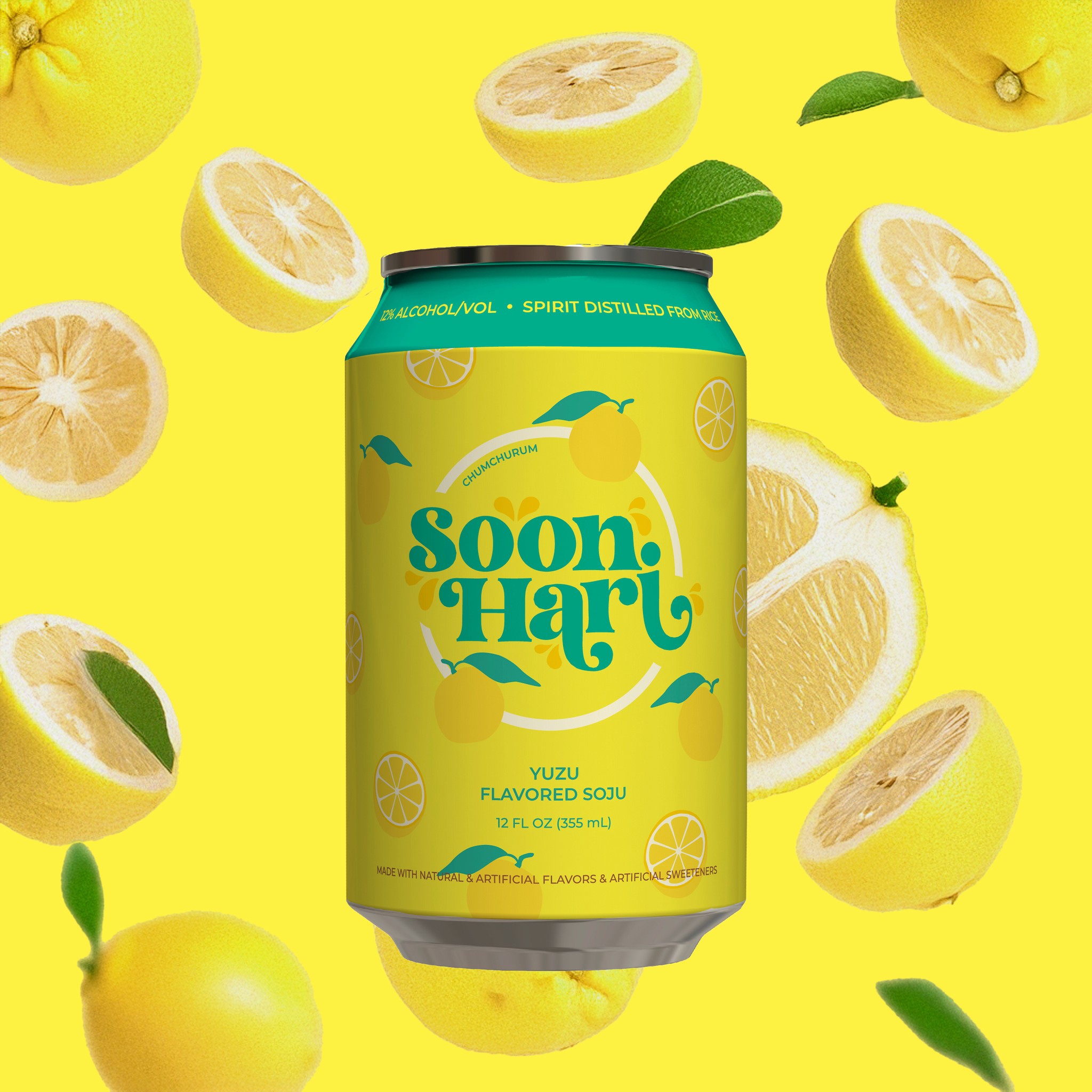
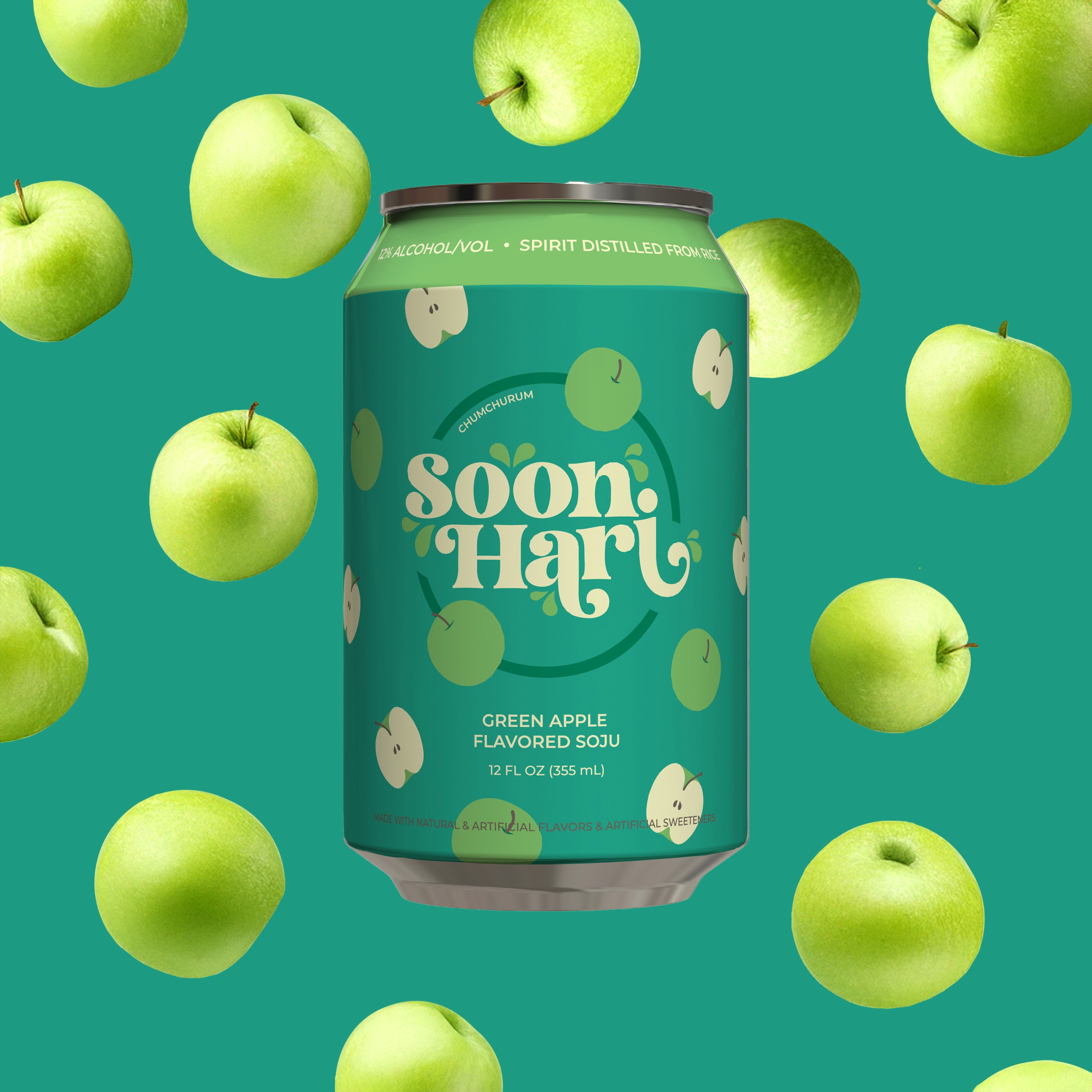
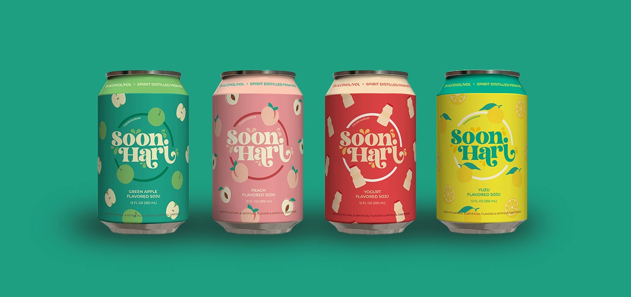
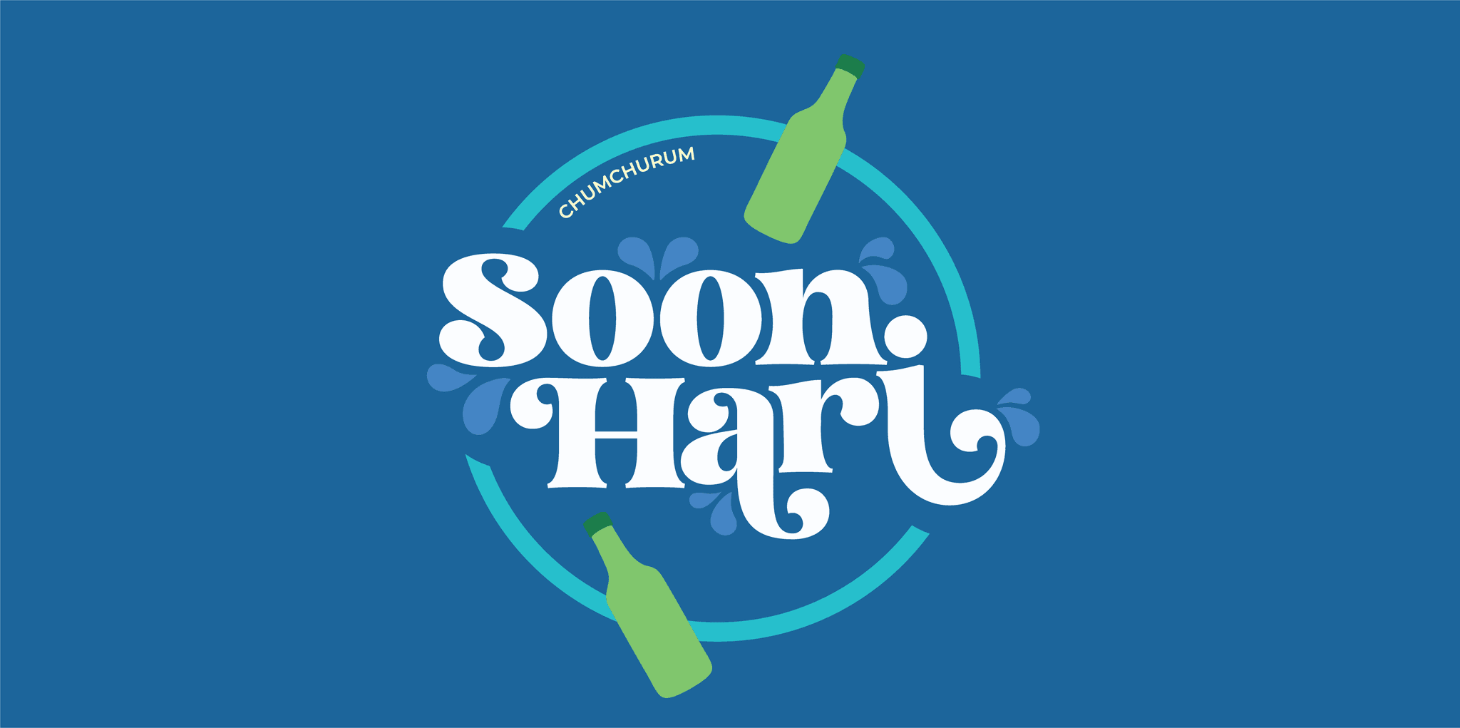
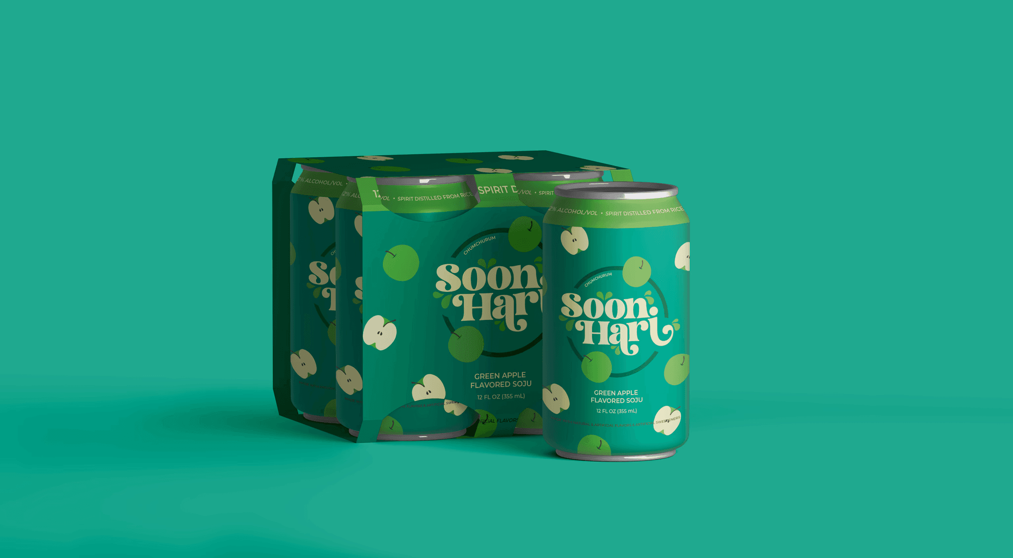
The logo was created using a swash font called Malibu and droplets to evoke a refreshing taste. The flavoring of the drink change with each different flavor to further that sense of refreshment with flavor. The overall logo was created with a stamp in mind as it is an imported product.
Soju is most often packaged in glass bottles and is meant to be poured into a soju shot glass. With the popularization of flavored soju and flavored hard seltzers in recent years, I wondered if it would make more sense to shift the packaging of the product from bottle to can as it would be easier to drink and eliminate the need to have shot glasses around.
Marketing to the West
My vision for marketing and advertisements would be to emphasize the flavoring of the drinks. The product tastes good and I felt the visuals needed to push the flavors and make it was obvious as possible and delightful to the eyes as well. Falling fruit and splashes seem to do the trick.
Would you drink this?
